 |
In recent years there's been an explosion of affordable "creator" monitors from companies like BenQ, ASUS, MSI, and Dell. Monitors aimed at prosumers who want to make the most of their creative pursuits but aren't in the market for professional-grade monitors from brands like EIZO and NEC. That explosion has been paired with a growing interest in monitor calibration, because if you're going to pony up the extra cash on a "color accurate" monitor you want to (a) confirm the company wasn't lying to you, and (b) make sure it stays accurate for many years to come.
Unfortunately, all of that consumer interest in color accuracy kind of hits a wall when it comes to educational content. Basic explainers on colorimetry and color calibration are few and far between (there are some excellent exceptions), and many of the ones that do exist are penned by companies that are trying to sell you something. If I type "Hardware vs Software calibration" into Google the first three results are from BenQ, EIZO, and ViewSonic... not exactly the unbiased educational content you're looking for.
As the long-time photo-video nerds of the Internet, we're trying to fill that gap with a few high-quality explainers and how-to articles on color measurement and calibration. Last month, we went over the basics of Colorimetry: how we measure and plot color, how the "Delta E" color distance metric is calculated, and how colorimeters work. Today, we'll move on to the next topic: explaining exactly how monitor calibration actually works.
 |
How Monitor Calibration Works
Technical articles on display calibration can get very confusing, but that confusion often comes down to the technical jargon that gets thrown around assuming you know what it all means. Terms like "calibration curves," "tone response curve," "gray balance" and "gamut coverage" are often glossed over and the difference between a "profile" and "calibration" is never fully explained.
To try and avoid this confusion, we're going to stop and explain each of our key terms as we go along.
By the end, you should understand what your calibration software is trying to do every step of the way, and how the final product of a display calibration – typically an ICC profile – changes the colors that are being shown on the screen so that they're more accurate.
Step 1: Calibrating Brightness and White Point
When you start a calibration, the first step is to manually adjust your brightness and (if possible) your white point using the on-screen controls available on the monitor. Every monitor gives you the option to adjust the brightness manually, but some will let you change the Red, Green, and Blue "gain" as well, so that you can manually adjust your white balance.
The white point is simply the point in color space where your display's pure white will sit, and that exact point is determined by how much energy the red, green, and blue primaries contribute when they're each turned up to 100%. For digital work, we're usually aiming for a white point of D65, which sits at (0.3127, 0.3298) in xy Chromaticity space and correlates to a color temperature of 6500K (hence D65).
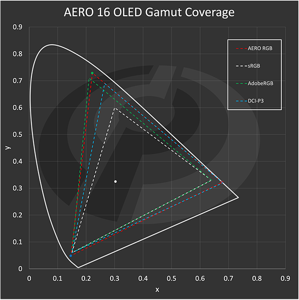
Here's the color gamut of an AERO 16 OLED laptop display that I recently tested. The red, green, and blue points are the primaries, and the white dot is my white point.
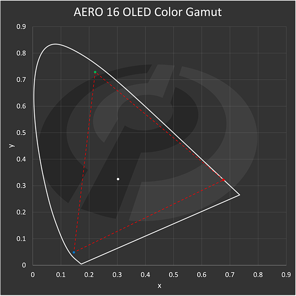 |
| The color gamut of the 2023 Gigabyte AERO 16 OLED's built in display. |
When calibration starts, the software will display a patch of pure white and it will ask you to adjust your monitor settings manually until you've reached your target values. This is usually accompanied by a helpful little dialog box that shows you how close (or far) you are and which way to adjust each setting in order to properly dial things in.
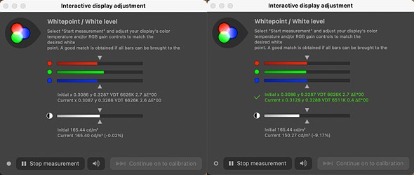 |
| White point and luminance calibration in DisplayCal |
This screenshot from the free open-source calibration software DisplayCal shows a before and after image of this dialog box. In this case I was aiming for a luminance of 150 candelas per square meter (aka Nits) and a white point of D65, and once I reach those values I can click "stop measurement" and then "continue on to calibration."
Step 2: Measuring Tone Response and Gray Balance
Once you've dialed in the brightness and white point to the greatest extent that your monitor will allow, the software will take the reins. It will measure a full gray ramp from pure black (0, 0, 0) to full white (255, 255, 255), keeping track of your monitor's tone response curve and gray balance as it goes.
These two terms describe two different aspects of your monitor's ability to create smooth and color accurate transitions from your darkest to your lightest gray values.
1. Tone Response
Tone Response describes the relationship between the input value that is being sent from your GPU and the output that's actually being shown on the screen. As you probably already know, your display doesn't show perfectly spaced linear brightness steps between pure black and pure white; instead, the output follows a gamma or "transfer function" that is usually a power of approximately 2.2.
This calculation is actually applied to values ranging from (0, 0, 0) for pure black to (1, 1, 1) for pure white, and then the values are multiplied by 255 to give us the 256 color values from 0-255 that we're used to seeing for 8-bit RGB.
This way, a value of 0 and a value of 1 both remain unchanged (because 02.2 = 0 and 12.2 = 1), but all the values between 0 and 1 should follow a smooth exponential function. In the graph below, I measured nine points from pure black to pure white on my MacBook Pro 14 and plotted them against the idealized gamma of 2.2:
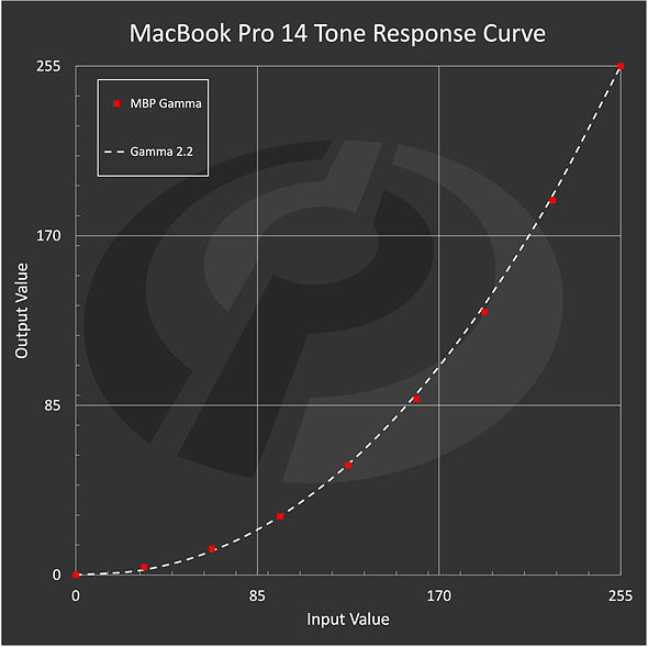 |
| In "Photography - P3" mode, my uncalibrated MacBook Pro 14's tone response gets close, but can't quite match a gamma of 2.2. |
2. Gray Balance
Tone response describes how smoothly the gray values ramp in terms of their luminance relative to pure white, but this isn't the whole story. We don't just want the brightness of gray to ramp smoothly from black to white, we also want "gray" to stay "gray." If there are color shifts along the way, your "neutral" colors won't be truly neutral.
This is where gray balance comes in. As it's measuring the luminance of the gray values, the software is also plotting their location in color space, AKA their chromaticity.
Remember from our intro to colorimetry, chromaticity ignores luminance and only tells us about color, so every gray value would ideally plot to the same point in this (x, y) space. This would mean they are all the exact same color, changing only in brightness. Of course, in practice, this is almost never the case. In the graphs below I've plotted the gray balance of my MacBook Pro. Since the points are so close together, the right panel is zoomed in so you can actually see the distribution:
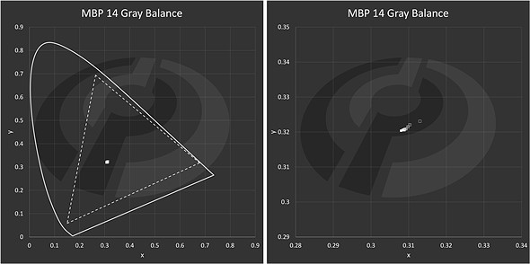 |
| Gray balance of the MacBook Pro 14's display in even steps from dark gray to pure white. Zoomed in on the right hand side for visibility. |
And here is the gray balance of an MSI gaming monitor I had nearby, which has a very similar color gamut but is far less accurate. This monitor prioritizes speed over color accuracy, and that's obvious when you look at the gray balance. The darker grays have a significant green cast that gradually goes away as the grays get lighter and lighter:
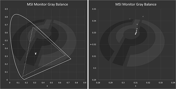 |
| Gray balance of an MSI gaming monitor in even steps from dark gray to pure white. Zoomed in on the right hand side for visibility. |
If the gray value is moving around a bunch, this means that the red, green, and blue components of the signal aren't properly balanced as you increase from black to white, and this will need to be adjusted during calibration in order to produce a smooth tone response curve and a stable white point.
Step 3: Adjusting Your Monitor's Output
After making these measurements, the software has everything it needs to adjust the output of your monitor so it more closely resembles some ideal target values that you can set in software. And it does this using something called calibration curves.
Calibration curves contain instructions for fixing the little imperfections in how your monitor displays color and brightness information. A typical display calibration will produce three different calibration curves, or 1D look up tables (LUTs): one for the red channel, one for the green channel, and one for the blue channel. Each one tells your GPU "hey, when you want to send out this value, send this one instead."
For example, the first few entries might look like this:
| Input Value | Red Output | Green Output | Blue Output |
|---|---|---|---|
| 0 | 1 | 0 | 0 |
| 1 | 2 | 1 | 1 |
| 2 | 2 | 3 | 2 |
| 3 | 3 | 4 | 4 |
| 4 | 4 | 4 | 4 |
| ... | ... | ... | ... |
And graphically, the calibration curves might looks like this:
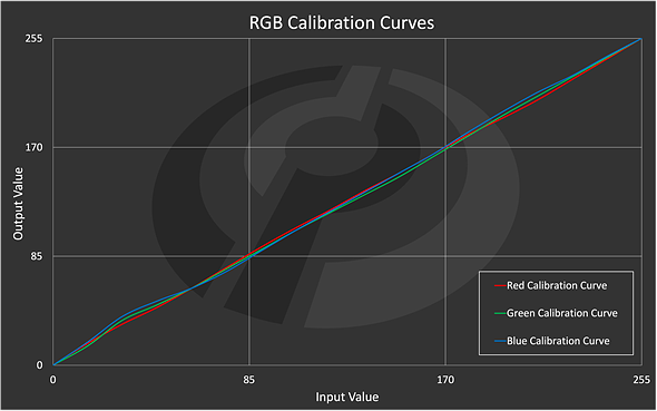 |
| Made up calibration curves that show the adjustments made to "correct" the response of the red, green, and blue values from 0 (darkest) to 255 (brightest). |
If the display were perfect, these lines would be perfectly straight and overlapping from 0 to 255. But because the display has some imperfections the calibration software has created three independent corrections for the red, green, and blue channels that will try to do two things at once:
- It will try to get your tone response curve to match some gamma target like 2.2, 2.4, or the special gamma curve specified by the sRGB standard.
- It will try to fix your gray balance so that every gray value plots to the same point in color space as your white point.
Additionally, if you aren't able to adjust your white point using manual controls in Step 1, the calibration curves will also attempt to adjust this by clipping the brightest red, green, and blue until the balance is right.
The better your monitor is out of the box – with a smooth tone response and stable gray balance – and the more closely you can dial in your white point using manual monitor controls, the less these calibration curves will need to do. But if you're starting with a very low quality monitor or you can't be bothered to take the time to manually calibrate your white point, the curves might have to work very hard, and aggressive calibration curves can produce banding artifacts and other issues.
Step 4: Creating an ICC/ICM Profile
Once the software is done measuring and adjusting your display, it will save the result as a monitor profile, typically an ".icc" or ".icm" file (they are identical). This profile contains two very important pieces of information.
1. Display characteristics
First, the profile includes information about your monitor's key characteristics, like the XYZ values of your red, green, and blue primaries, the brightness and color coordinates of your white point, and the tone response curves for your red, green, and blue channels.
The color coordinates of your RGB primaries is what allows you to calculate the "gamut coverage" by comparing your monitor's color gamut against standards like sRGB or AdobeRG. For example, here's the gamut of that OLED laptop display I mentioned earlier plotted against the sRGB, AdobeRGB, and DCI-P3 gamuts:
When you read that a display covers "98% of AdobeRGB" what they mean is that the triangle formed by the Red, Green, and Blue primaries of the display overlaps with 98% of the triangle formed by the standardized RGB primaries of the AdobeRGB color space (the green triangle above).
But it's not just about advertising your monitor's specs. The display information contained in the profile allows color-managed apps like Photoshop to accurately display other kinds of content.
For example, the AERO display's pure red and pure green are way more saturated than the sRGB standard, so if you tried to show an sRGB-encoded image on this monitor without any kind of color management, the reds and greens would be way too saturated. Color-managed apps can use the information in your monitor profile to display an sRGB image the way it was meant to be shown. Since it knows where your monitor's pure red (255, 0, 0) actually sits in color space, it can do a little bit of math and decide that pure red for an sRGB image, which is far less saturated, will be matched by your monitor at (245, 8, 12).
2. Calibration Curves
The second important bit of information contained in a profile is the calibration curves. Note that a profile does NOT have to include any calibration information. You can profile your monitor without calibrating it, and that will still make it more accurate when using color-managed applications because of what we mentioned above. In fact, a bare-bones profile usually still includes "calibration curves," they're just straight lines from 0 to 255.
However, if you do calibrate your display, the profile created by your calibration software is where the calibration curves will be stored.
Now, when the profile is loaded into the operating system properly, the calibration curves will adjust the colors coming from your GPU to make all your output more accurate, whether or not you're using a color-managed application. The information about your RGB primaries and white point will still be used by color-managed apps to convert between different color spaces, but it's the calibration curves that will be used to fix your monitor's gray balance, adjust your white point, and tweak your tone response so it's closer to the ideal output.
Step 5: Verification
The final step in the calibration process is a check or "verification." Not all software will do this, but most will apply your newly created profile and display a bunch of color patches – usually a standard set of 20-40 colors, plus a gray ramp – measure the output, and compare it against the color coordinates it was expecting to see.
This will produce a "report" where you can see the Delta E color distance between the color that your display showed and the one that it should have shown:
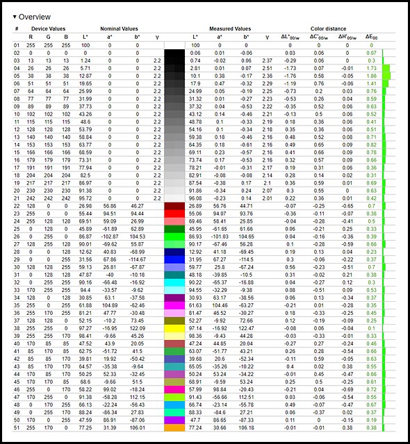 |
| Profile verification report from DisplayCal. Since we're checking the accuracy of a profile that was just created, all the values should be nearly perfect (and they are). |
Since we're checking a profile that was just created, and we're using the same colorimeter to verify the profile that we used to create the profile, the results should always be pretty good. This is just a double check to make sure that something hasn't gone horribly wrong, or your display isn't so fundamentally bad that it's unsalvageable.
Note that we didn't calibrate for these exact colors: we simply created a profile that tells the computer how our monitor behaves, and we corrected for gray balance and tone response. By checking a bunch of random colors evenly spaced throughout the monitor's gamut, we can see how accurate the monitor's color reproduction actually is given the newly corrected red, green, and blue channels.
Optional Extras
These are the five steps that every basic software calibration goes through to characterize your display's output and fix imperfections that it might find, but there are at least two more advanced options that I should mention. These are 3D LUT calibration, which is a more advanced and powerful way to calibrate your display's output, and Hardware Calibration, which is an option you'll find on many high-quality photo- and video-editing monitors.
3D LUT Calibration
3D or "Cube" LUT calibration is a more advanced and precise calibration that can address things that your standard 3-by-1D LUT calibration curves simply can't touch. As you can tell from the examples above, standard calibration curves adjust each color channel individually for the values 0 - 255. This only really allows you to smooth out the tone response, adjust the white point, and/or fix the gray balance, because the only "color" where the red, green, and blue channel are all the same value is gray.
However, if you want to totally re-map your monitor so that it mimics another color space (like sRGB, for example) or if you want to fix issues with specific colors in the middle of your monitor's gamut, three separate 1D LUTs just can't do that.
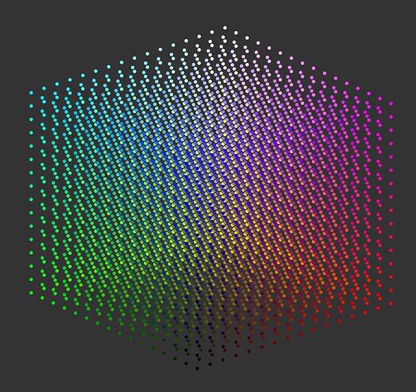
A 3D LUT can do both of these things because it contains corrections for all combinations of red, green, and blue, not just the response of the individual primaries. Visually, a 3D LUT looks something like this, where each point represents one specific combination of red, green, and blue that can be precisely adjusted.
The limitation of 3D LUTs is that you can't possibly calibrate for every single value. In a standard 8-bit display you have 256 values per channel (0-255) and a total of three channels, which comes out to 2563 = 16,777,216 possible colors. To get around this issue most 3D LUTs are created by sampling a smaller subset of values ranging from 5 to 64 values per channel, and interpolating the rest using special algorithms that vary from company to company.
A typical 3D LUT calibration will combine a Cube LUT with three 1D LUTs to get the best possible results. The 1D LUTs will take care of the gray values to produce a near-perfect tone response curve, while the 3D LUT takes care of color corrections for every other combination of red, green and blue.
The nuances and details of 3D LUT calibration are beyond the scope of this explainer, and you won't find this option on consumer grade software, but high-end calibration solutions like Portrait Displays and Light Illusion that are used by professional studios rely on 3D LUTs for hyper-accurate color calibration and/or color space simulation.
Hardware Calibration
Finally, there's hardware calibration. Everything we've talked about so far is software-based, meaning that the calibration curves (or 3D LUT, for that matter) lives on your computer and tells your GPU what values it should be sending to your display. If your monitor isn't accurate, the new values will make it more accurate.
The problem with this approach is that your calibration curves can't create new values, it can only adjust the 256 values per channel that are being sent from your GPU. Because of this limitation, every single adjustment eats away at your color depth by removing one value and replacing it with another. In the worst cases where your monitor is way off and you can't adjust your white point manually, the calibration curves may have to do a lot of work to fix the output. This can produce uneven results where some values are skipped altogether and others are repeated multiple times, producing banding and/or crappy gray balance.
A gray ramp that should look like this:
 |
Might end up looking like this instead:
 |
This is an exaggeration, but it highlights the problem of having a limited number of values to work with. You can make small adjustments without anyone noticing, but large imperfections can't be fixed without creating problems elsewhere.
With hardware calibration, the calibration curves or 3D LUT are saved to a chip in the monitor itself at a much higher bit-depth (often 14- or 16-bit) and then applied at the level of the monitor rather than adjusting your GPU output. So the GPU can continue sending all 256 values unaltered, and the monitor applies its own high-accuracy correction by using the 14- or 16-bit LUTs stored on that chip to adjust to the signal that's sent to each pixel.
Hardware calibration also means that the calibration is "sticky" because it's stored in the monitor itself, so no matter what computer you connect, the display will always show the same accurate colors. With software calibration, the ICC profile containing your calibration curves for that monitor have to be generated and stored on each computer that you use with that particular display.
In practice, a software calibration will produce similar results to a hardware calibration if you're using a high quality monitor that's designed for photo or video editing. Issues with software calibration are more pronounced if your calibration curves have to do a lot of work to fix a low-end monitor's janky output. But the convenience and improved accuracy of a monitor that's compatible with hardware calibration makes this a prized feature among creatives.
 |
Conclusion
Unsurprisingly, we're big believers in the power of understanding how something works, and understanding monitor calibration is crucial if you want to get the most out of the software and hardware that's available to you.
This series of articles on color measurement and monitor calibration started as a review of a single colorimeter, but we quickly realized that the review would be meaningless to readers who didn't understand how color measurement or calibration actually works, and when we went looking online for solid explainers that we could point to, we came up empty.
Now that we've laid the foundation, we can move forward with the remaining articles in this series.
Next, we'll publish a step-by-step guide to calibrating your photo- and video-editing display at home, using the info above to show you how to get the best possible results using the consumer-grade hardware and software that's available to most people. Then we'll move on to high-quality technical reviews of that hardware and software, so you can decide where to spend your hard-earned money.
In the meantime, if you have additional questions about colorimetry or calibration, drop them in the comments below! As ever, our goal is to provide a high-quality technical resource that's accessible enough for hobbyists but not so basic that the experts are sitting in the audience gritting their teeth. Let us know how we did, how we could do better, and anything else you might want us to cover on this topic in the future.


Comments